The Cart Widget can be used to add a cart icon with drop-down or slide-out functionality to the global header of your site.
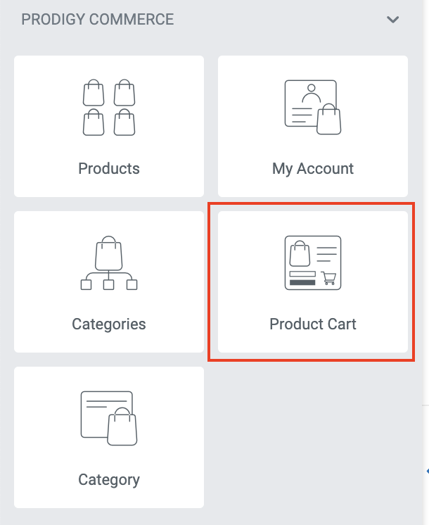
To get started, open the Elementor editor for the header template where you want to use the cart widget. In the list of widgets in the left column, scroll down to the Prodigy Commerce section and drag the Product Cart widget into the appropriate section.
Content Tab - General
In the content tab of the widget settings, the General section provides several basic settings that define the look and functionality of the cart widget.
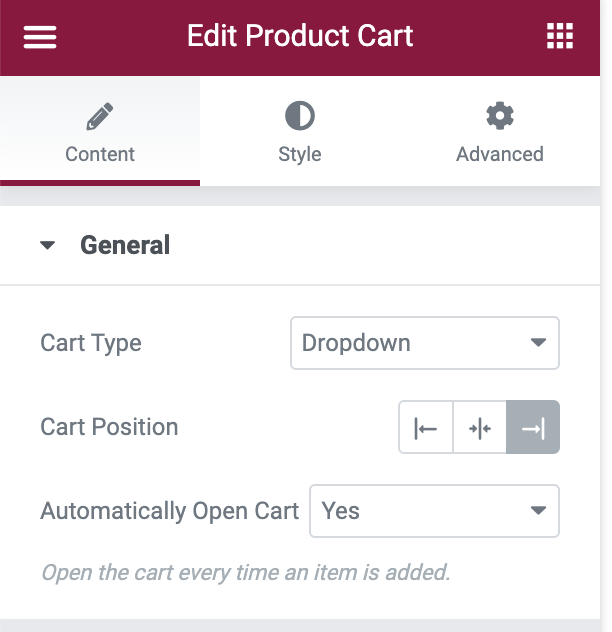
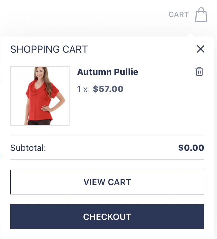
If the Cart Type is set to Dropdown, the cart details will drop down below the button as shown below.
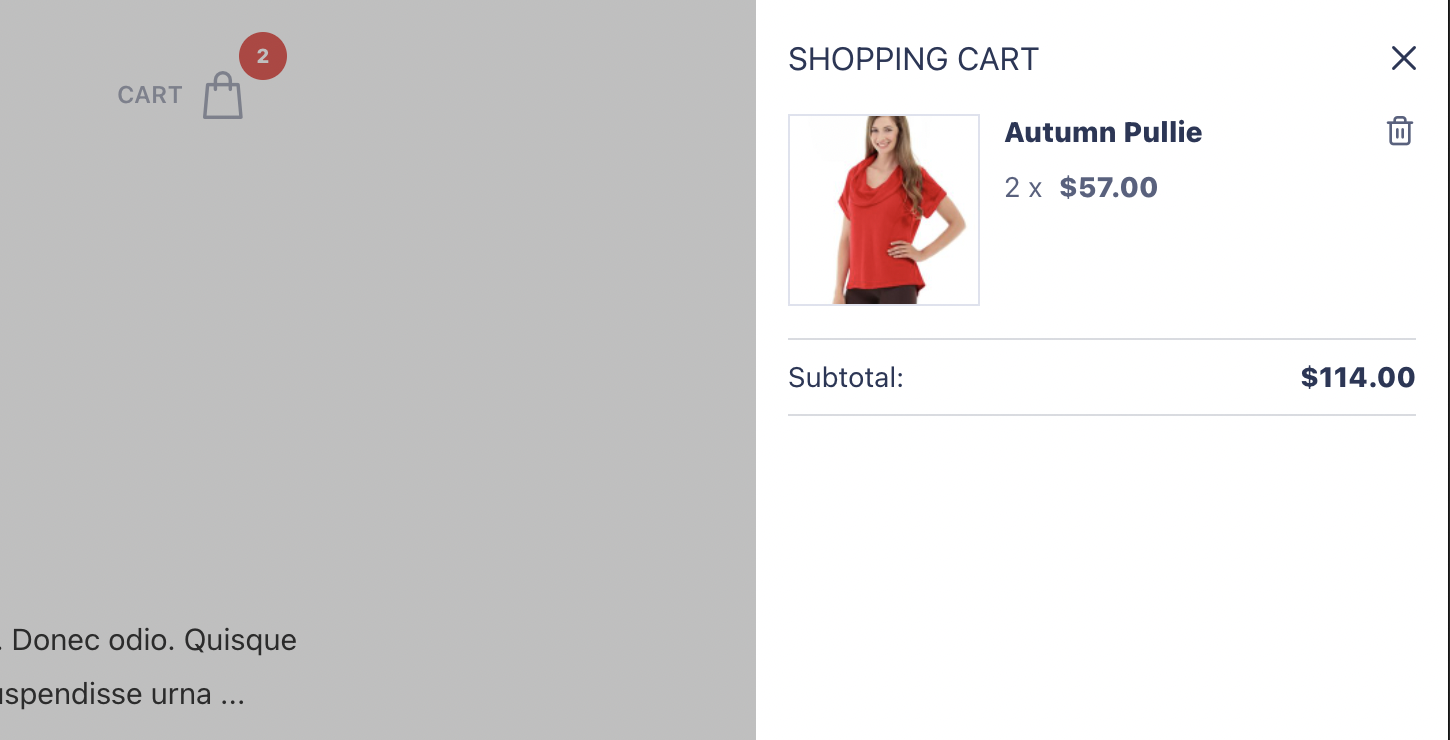
If the Cart Type is set to Slide, the cart details will slide out from the right side of the browser window as shown below.
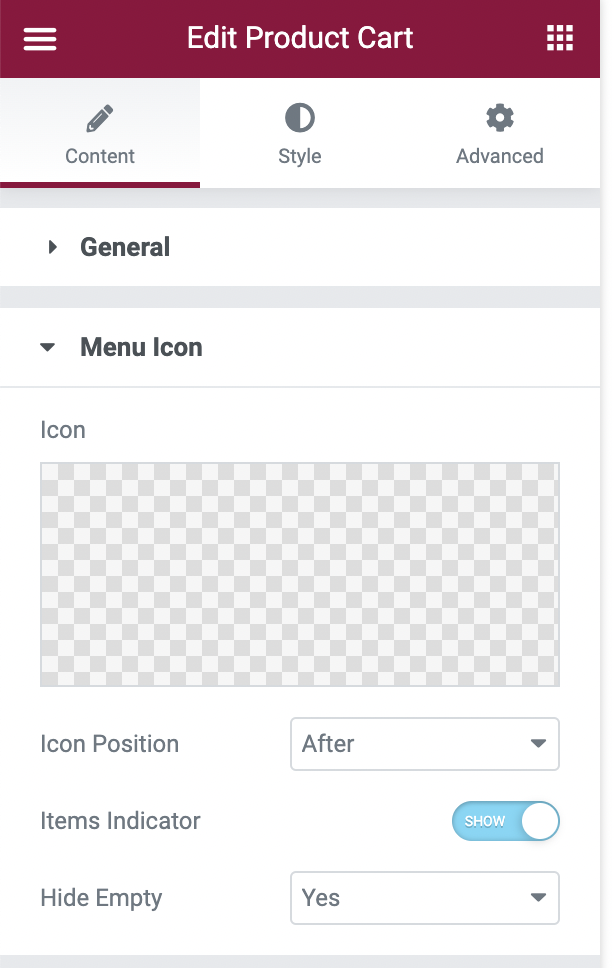
Content Tab - Menu Icon
In the content tab of the widget settings, the Menu Icon section allows you to select a different icon from the icon library or upload a custom SVG file. You can also specify the position of the icon and the visibility of the indicator of the number of items in the cart.
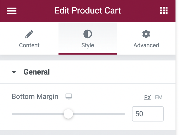
Style Tab - General
In the Style tab, the General section contains the following control for the bottom margin.
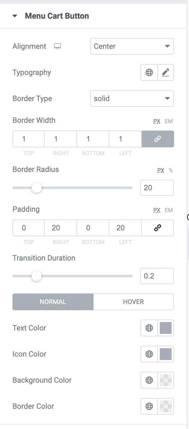
Style Tab - Menu Cart Button
In the Style tab, the Menu Cart Button section contains the following controls that affect the button.
Style Tab - Menu Cart Button - Menu Icon
In the Style tab, the Menu Icon section contains the following controls that affect the cart icon within the button.
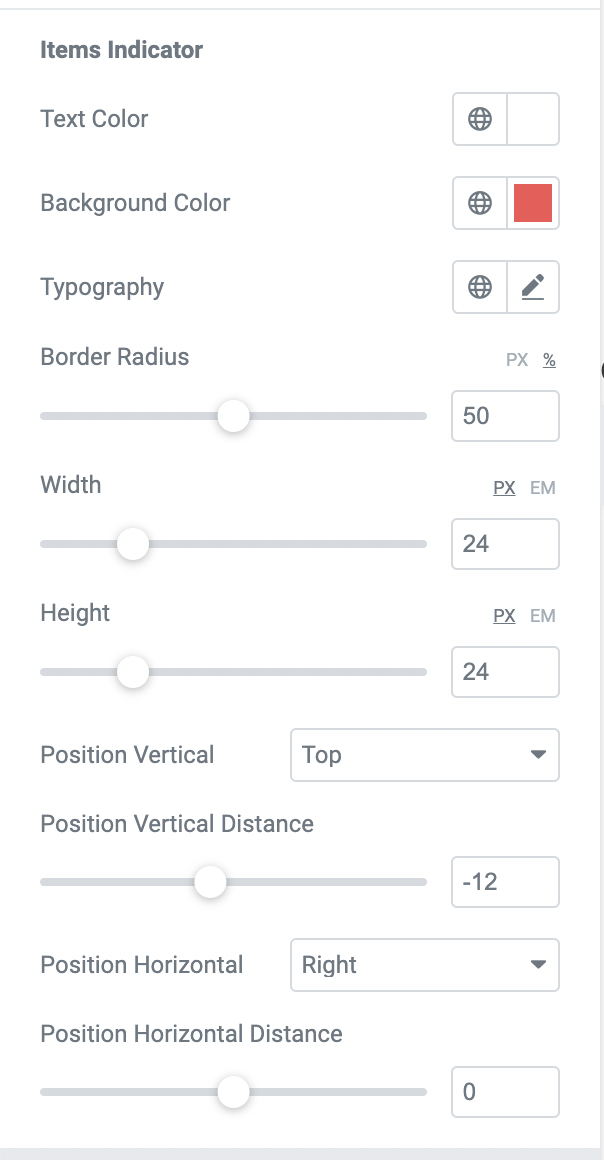
Style Tab - Menu Cart Button - Items Indicator
In the Style tab, the Items Indicator section contains the following controls that affect the quantity indicator within the button.
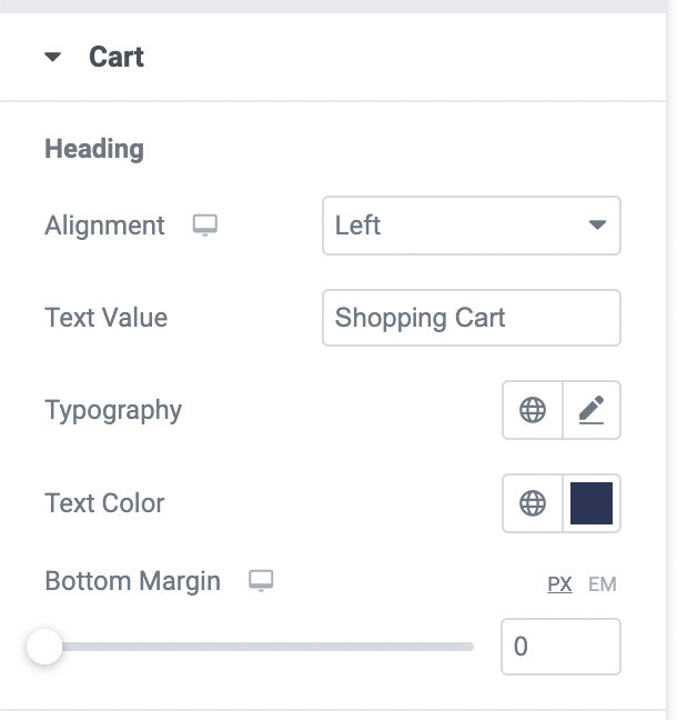
Style Tab - Cart - Heading
In the Style tab, the Heading section contains the following controls that affect the heading of the expanded cart.
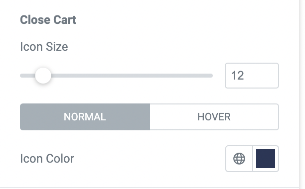
Style Tab - Cart - Close Cart
In the Style tab, the Close Cart section contains the following controls that affect the icon that is used to close the expanded cart.
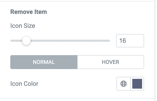
Style Tab - Cart - Remove Item
In the Style tab, the Remove Item section contains the following controls that affect the icon to remove an item from the expanded cart.
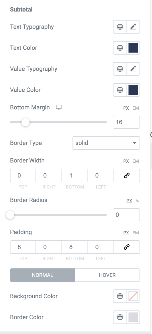
Style Tab - Cart - Subtotal
In the Style tab, the Subtotal section contains the following controls that affect the subtotal in the expanded cart.
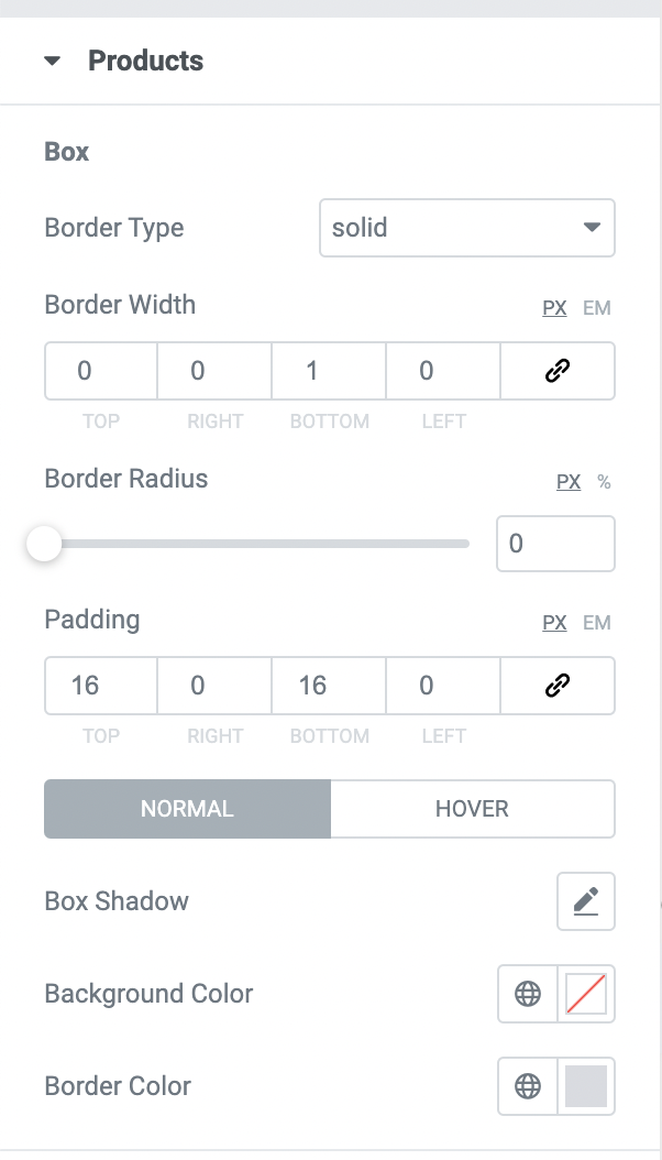
Style Tab - Products - Box
In the Style tab, the Box section contains the following controls that container around each product in the expanded cart.
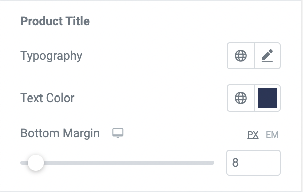
Style Tab - Products - Product Title
In the Style tab, the Product Title section contains the following controls that affect the product title of each item in the expanded cart.
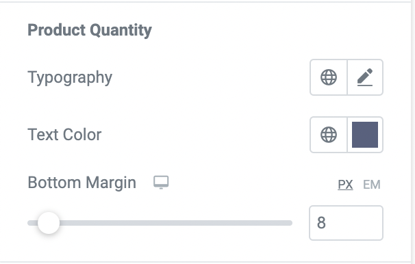
Style Tab - Products - Product Quantity
In the Style tab, the Product Quantity section contains the following controls that affect the quantity of each item in the expanded cart.
Style Tab - Products - Product Price
In the Style tab, the Product Price section contains the following controls that affect the price of each item in the expanded cart.

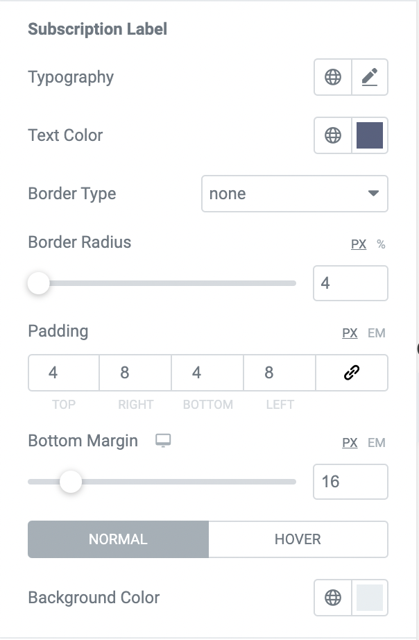
Style Tab - Products - Subscription Label
In the Style tab, the Subscription Label section contains the following controls that affect the subscription label for each subscription product in the expanded cart.
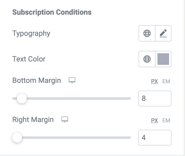
Style Tab - Products - Subscription Conditions
In the Style tab, the Subscription Conditions section contains the following controls that affect the subscription conditions labels for each subscription product in the expanded cart.
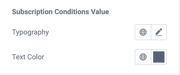
Style Tab - Products - Subscription Conditions Value
In the Style tab, the Subscription Conditions Value section contains the following controls that affect the subscription condition values for each subscription product in the expanded cart.
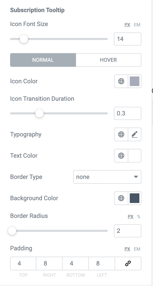
Style Tab - Products - Subscription Tooltip
In the Style tab, the Subscription Tooltip section contains the following controls that affect the subscription tooltip for each subscription product in the expanded cart.
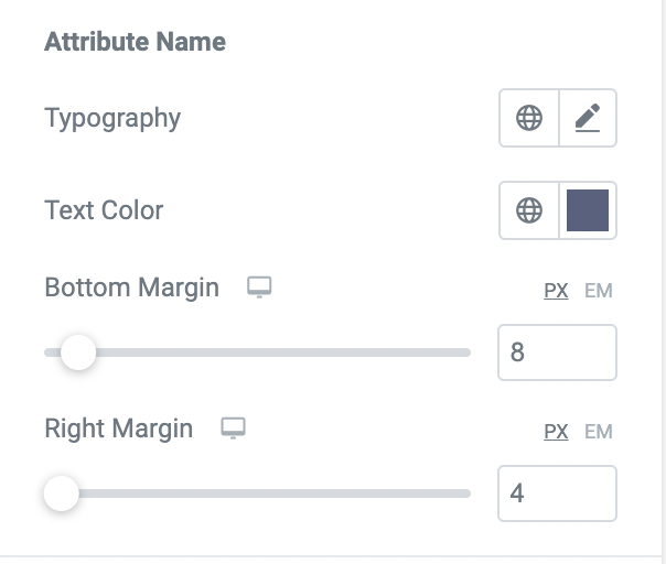
Style Tab - Products - Attribute Name
In the Style tab, the Attribute Name section contains the following controls that affect the attribute names for each product in the expanded cart.
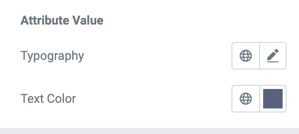
Style Tab - Products - Attribute Value
In the Style tab, the Attribute Value section contains the following controls that affect the attribute values for each product in the expanded cart.
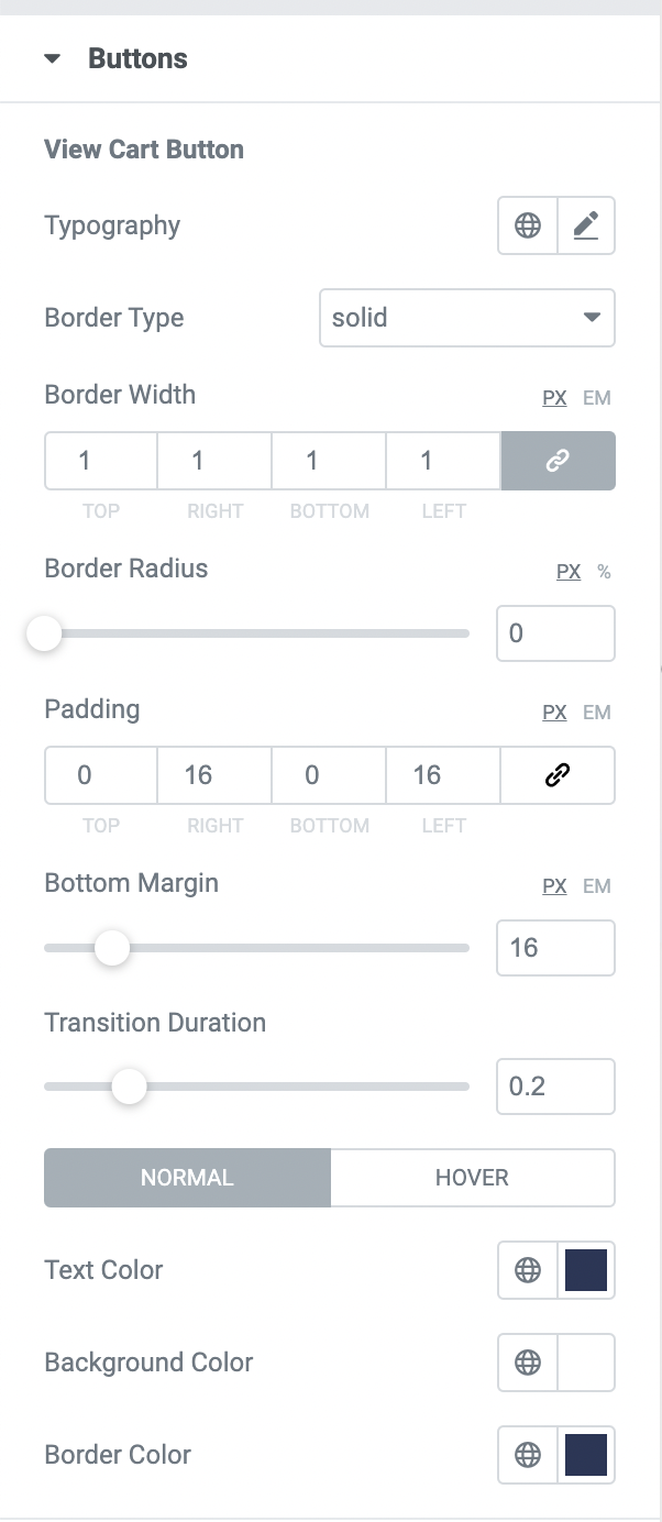
Style Tab - Buttons - View Cart Button
In the Style tab, the View Cart Button section contains the following controls that affect the view cart button in the expanded cart.
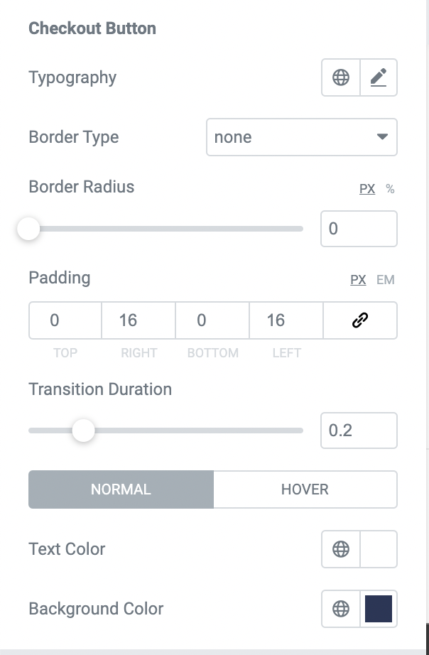
Style Tab - Buttons - Checkout Button
In the Style tab, the Checkout Button section contains the following controls that affect the checkout button in the expanded cart.
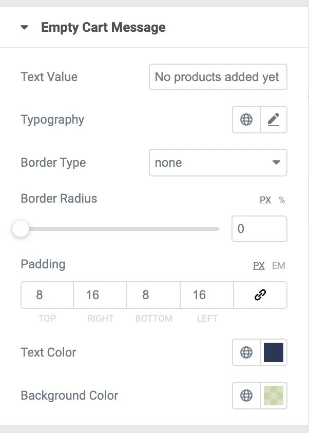
Style Tab - Empty Cart Message
In the Style tab, the Empty Cart Message section contains the following controls that affect the message in an expanded cart when it is empty.